Pages

Monday, September 24, 2012

Reclaimed Wood Animal Friend Silhouettes

Have I ever mentioned that I love to recycle?  It definitely drives my husband nuts, as he thinks I over-do it.  I mean, I don't put the ziploc bags in the dishwasher?!? (I clean them by hand.)  And I will find uses for pickle jars, store my spools of ribbon on my plate holder, and rarely forget re-useable grocery bags.

So when I create something new, by recycling wood, well, that just makes me happy!  And these little animal friends of mine are just so damned cute, you should be smiling too!


I only got as far as the dog and hedgehog, but I'm bound to add more to the little zoo.

I have to give tons of credit to Sand and Sisal, this wonderful blog that I discovered on Hometalk. I saw her amazing shark pallet art and HAD to create something of my own.  Thanks so much for the inspiration!

Each one of these little guys was made with deconstructed pallet wood.  After blowing up the images, and creating them into line drawings, I traced around them on the wood. Using my handy-dandy scroll saw, I cut out the negative space.  Then each piece of wood was glued and nailed to a support piece.  The support piece is about an inch thick, giving the silhouette some depth.


I love the character in each piece of wood.  I also tried to keep the nail heads in place, when possible.  This gives it such a rustic quality.  Each piece was sealed with polyurethane, then waxed for that great hand-wax lustre and feel.


Try your hand at creating your own, unique pallet silhouette art.   


If not, feel free to wander on over to my shop where you can buy one off the shelves.  I'm happy to discuss custom work with you as well.


Have a great day!


Debbie


Wednesday, September 19, 2012

Meet Madeline, the side table

Why, OH WHY, do I continue to forget to take before shots?  It's a shame.  I wanted you to see how I transformed this boring, greyish, you-stick-in-the-corner-of-a-room-and-pile-it-with-loads-of-crap side table.  All I've got is the after to share with you.


So, I covered this little lady in a dark brown Valspar Ultra paint and primer.  Next, I thought I would try some Williamsburg Buttermilk Paint, in Fancy Chair Yellow.  After some distressing, I then glazed with General Finishes Van Dyke Brown.  Finished it off with furniture wax.


I decided to keep the original hardware and just paint over it.


 Updated the inside drawer by coating with the dark brown paint/primer.


 I think she's pulled herself quite nicely out of the corner and belongs in the spotlight.


If you would like her in your home, you can find her in my shop.  Thanks for looking!


Debbie 
Sharing with:


Sunday, September 16, 2012

Updating the side tables


Part of my goal in transforming our living room was to spend as little money as possible. Cheap, frugal, thrifty, economical, tight-waddish . . . . call if what you may.  I call it smart.  Or that's what I tell myself.

So, I liked these side tables.  The kids hadn't broken the glass on top and they had withstood a good seven years of paw scratches, spilled nail polish remover, sticky juices, fishy cracker crumbs in their crevices, and many other unmentionables.  So they deserved to stay.

And one coat of Paris Grey chalk paint would do the trick.


There was no need for more than one coat as, you can see, I heavily distressed the pieces.  Heck, there are bound to be more doggie paw scratches, so this worked perfect.


I added a coat of wax over the paint and called it a day.  Seriously took me about an hour to clean, paint, distress, and wax.  No pre-sanding or priming needed.


I do love to mix heavily distressed pieces with the clean look of other pieces.  Go ahead and give those tired looking pieces in your home a new color.  You can make such a dramatic difference just with paint.  

Debbie
Sharing with:


Sunday, September 9, 2012

The Candy Shoppe Party

On the morning of Haley's big party, we wanted to wake her up with a bang (or pop).  I found the idea on Pinterest:  tape plastic (we used a sheet with tacks) on the door and stuff with balloons.  When she opened her door, she was welcomed by an avalanche of balloons.  (photo courtesy of Pinterest).


Our little girl was turning four.  So I thought . . . what does Haley like?  Princesses, Barbies (she calls them ladies), clothes, shoes, etc . . . . all the girly things.  But what does she love?  CANDY.  That began my Google and Pinterest search for all things candy.  :)

My vision:  a beautiful candy shoppe, set under a white tent, where the kids can "shop" for candy after earning Haley Dollars through playing games.  Unfortunately, the weather did not agree with my vision.  After taking 2 hours in the morning to set up the shoppe in the backyard, under a white tent, I checked the radar to find showers were moving in for the start of the party and continuing through the night.  I'm a girl who takes a long time to recover from her plans not going as planned.  But alas, we had to make due.  So, Haley's Candy Shoppe was set up in the garage, where it would be free of the rain, but not sawdust.  **Try to see beyond the ugly concrete floors**.


Hmmmm . . . . let's see.  We had Twizzlers, Sour Patch Kids, Chalk Lollipops, Jelly Belly Jellybeans, Candy Bracelets, Gummy Worms, Spice Drops (what was my husband thinking?!?), Swirl Lollipops, Marshmallow Lollipops, Skittles, Double Bubble Gum, Peppermint Sticks, Rock Candy, Tootsie Pops, Mike & Ikes, and Caramel Creams.  I decided against chocolate thinking it would be sitting in the sun and just melt.  Ha!


I LOVE this bunting!  I made it using scrapbook paper and it was so super easy.  I stored it in a ziploc bag so I use it again for other parties. I plan on posting a little tutorial on how to make it.  SO EASY! 


So I found these soda pop hats, as I couldn't think of what a candy shoppe scooper might wear.  Then I decided to add some dorky names to them.  My husband was Sugar Daddy.  Haley wanted to be Sweet Mama, but that one had my name written all over it.  :)


Painted the back of an Ikea box for her sign.


And the kids filled the bags, to the exasperation of their parents.  But I did include toothbrushes!!


Note:  I googled this photo because I forgot to take my own.  UGH!  But I wanted to include this idea for a cute candy decoration.  I just blew up a ballon, wrapped with colored cellophane and tiled ribbon on both ends to make it look like a wrapped candy.  So cute!


The plan was to have the kids spend their Haley Dollars at the candy shoppe.  My little lady helped to decorate her face.


Check out the amazing cake made by my friends Kristy and Tina, of KrisTina's Kreations.  Haley asked for lollipops on her cake, and they didn't miss a beat.


 What's a party without paper-striped straws?


I think the party girl was happy, doing her little jig.


So, the games included obnoxious husbands running them. SCORE!  First was a ring toss.  We used a pool diving ring and beer bottles.  Yeah, we're trashy that way.  You ring it, you get a buck.  Got get em' Will!


Next was the can toss.  Drop the peach can, and you've got yourself another Haley Dollar.  Get it Zach!


Here is Pin the Lollipop on the stick.  My little take on the good ole' donkey game.  Two bucks for getting it on the stick!  You go Callen!


Finally, we had large pieces of candy printed on paper, taped and hidden in the backyard. This kept the buggers busy for . . . oh. . . . five minutes tops.  ;)


Blowing out her candles. 


So, it's probably been about 8 weeks I've been thinking about this party.  I don't like to work last minute; I'm a planner.  I do a little here, a little there.  But in the end, I think the kids had a great time.  I doubt any of them had been to a candy party before (and I doubt their parents would let them go again).  So, when asking Haley what her favorite part of the party was, of course I was expecting her to say the candy, with all it's fabulous details.

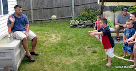
THE WATER FIGHT.  The impromptu water fight.  Instigated by the husbands.


The birthday girl gets caught in the middle
Ouch.

She definitely didn't see this coming.
Now that I think of it, perhaps this was my doing.  Sugar = sugar high.  Sugar high = impromptu water fight.

So, if you are thinking about a Candy Shoppe party in your near future, expect a sugar high closely followed by a water fight.  Or snowball fight.  Perhaps tricycle drag racing.

Anyway, everyone had a great time with memories in the bank.  And isn't that what it's all about?

Happy 4th Birthday Haley!!


Debbie
Sharing with:


Tuesday, September 4, 2012

Subway Art with the Silhouette Cameo and contact paper


Subway Art.  It's just not getting old with me.  Yet.  Ask me next year and we'll see if I edit this post.  ;)

I wanted a piece of that subway art in our home.  But I wanted it to have meaning.  So I choose to create memory subway art:  people, places, and times that hold a special place in my heart, as well as my family's.


But I didn't want the lettering to be vinyl.  I'm a paint girl and it had to be all about paint.

How in the world was I going to get those crisp, clean fonts to pop on my board?  I wasn't going to get the same look with hand painted lettering.  I knew I could use vinyl and then pull it off, revealing the paint underneath.  But that's kind of an expensive way to waste the vinyl and I'm all about saving where I can.  So, when I heard that people can use contact paper instead of vinyl, well giddy up sista, cause I'm on that train!  (I've never used that phrase before and promise not to use it again).

Okay, so after deciding on my "memories" and my fonts, I printed each one out on contact paper.  Here are the settings:  Media - vinyl; Speed - 8; Thickness - 3; Blade - 2. 


Just an FYI:  I am no expert at Silhouette.  I've hardly used the machine and I'm hoping to carve out some time to learn through tutorials.  But what I did learn is that the rollers and me, well, we're not friends.  If I don't make the rollers happy by making sure the paper is perfectly wide enough to grip it correctly, it never comes out right.  Ugh.  In the end, I felt like I had a lot of waste.  But, I did get a killer deal on discounted contact paper at Home Depot.  It turned out to be .17/linear foot.  Giddy up! (sorry, again)

After printing the lines, I cut them individually and peeled back the film to reveal the wording.   (Note:  use colored contact paper otherwise you won't see what the heck you are working with). 


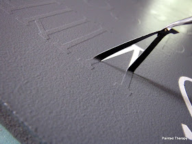
Use your hook tool to get rid of the bits of contact paper that didn't come off.


When all the strips were ready, I lined them up in the correct order and got an idea for how big I needed my board. 


I cut my board and decided I wanted the lettering to be white, so I painted the board white.  Rolling paint kicks butt.


Now, I needed to transfer the lettering to the board.  Silhouette sells transfer paper.  But, remember, I'm cheap.  So, instead, I used clear contact paper.  I cut them to about the size of my strips and pushed down really good.

This shows putting a clear strip of contact paper over the contact paper lettering.

Next, I made sure to dry fit all the strips on the board.  After deciding where to place the first strip, I pulled the clear contact paper up transferring the lettering.  Go slow with this process so you don't miss any dots on the i's or punctuation.


Next, I pressed the first strip into place.  Use your handy-dandy YMCA membership card to press it on good.  Fine, use your credit card instead.


I did find the best method to pulling the lettering off the transfer paper (clear contact paper), was to pull hard, but slowly, while I pressing into the seam of the contact paper.  Actually worked like a charm.

Putting a lot of pressure on the YMCA card
I made sure to use a ruler to check all my measurements after and before each new strip.  I wanted even space on the left and right, as well as pretty evenly spaced between lines.  

When finished putting the words on, I was kind of in love.  At this point, I was so psyched with the way it was coming out.  But not psyched enough to leave the contact paper on. 

Looking good!
For the love of Pete, if you learn nothing else from this tutorial, learn this:  PAINT OVER THE LETTERS WITH YOUR BASE PAINT!!  This will seal the edges so the next color paint you put on will not seep under your lettering.  You want nice, crisp letters?!?  DO IT!  Okay, I think I made my point.

A few very light coats will work.
After this layer of paint has dried, add your top color.  Since I just did a whole living room re-do with grays, I decided on a slate gray color.  After the few coats of that bad boy had dried, it was time to take the letters off.  See, this is where the vinyl would be wasted.  I'm just using the contact paper letters as a template, if you will.  At .17/linear foot, I can sleep at night.


If you heeded my warning suggestion, your letters should be crisp and clean.  Don't they just look baaaa-u-ti-ful?


You can leave your sign here, but of course, I had to do a little distressing.  I used a very find sandpaper on my electric sander and went to town.


You can see the distressing on the edge of the sign.
 That's it.  I didn't even seal it as it's just going on my wall and I'm not expecting little hands to touch it.  Now it's a big part of my family wall vignette.  


I love signs and I love fonts and I'm fond of memories.  The perfect combination.

Debbie
Sharing with: