Pages

Tuesday, March 26, 2013

Creating a Galley Wall and a Trick

I love photos.  Most people do, and we should be proud to display them.  A galley wall can just include photos, but you can also mix it up with other media and interesting finds.  Here's some of my favorite examples:

1.  Loving the simplicity of the lines and color.  I think the matted frames makes this an elegant, yet uncomplicated kitchen.  The utensils on the wall are their own form of art.


2.  Hello pop of color!  It's great when you can start from scratch like this, using the same color and size frames.  It makes quite a statement.


3.  Once again, big fan of the white frames.  But I liked how they used not only photos, but quotes, child's art, etc . . . to create a very cozy wall.


You also need to determine the "style" of your galley wall.  Perhaps you're the kind of person that needs every angle to match up perfectly.  Investing in a laser level will help you achieve that look.  For me, I'm a fan of just laying the frames in a pleasing manner with as close to equal space between them as possible. "Dry fitting" them on the floor first is a good idea.  There are also a ton of great tutorials on the web for achieving the perfect look.  But we're not about perfection here in the Christianson household.  :)

As for locations, there is no wrong place for a galley wall.  Most people would use a hallway as a general area, but think about the kitchen (as seen above), the kid's playroom or even a bathroom.  I found the perfect spot for us is up our stairs.  It makes a statement on an otherwise boring wall space.

So, for years I've collected frames on sale, clearance, flea markets, etc . . . and just kept a supply and slapped them on the wall when I had that just right photo to display.  This eclectic mish-mash of frames worked for quite awhile.


But recently I did a swooping change in the living room, and the eclectic mish-mash just wasn't cutting it anymore.  But I was also being strict with our budget, and although I love the look of all white or all black frames, I wasn't about to replace the complete collection.  So, I kept all the white and black frames, and then painted all the other frames with a punch of teal and chartreuse, to highlight some of the pops of color in our living room.


So, you're thinking to yourself, "Awwww . . . I do love the look of galley walls, but damned if I can keep all those frames straight?!?  And being the "A" personality that I am, I won't attempt it unless I know I can have 90 degree perfection!"  You were thinking that, weren't you?!?

Here's where I tell you about a trick?

Glue dots.

There.  I said it.  The trick is glue dots.


Yup.  Those funky little dots you buy in the scrapbooking section of AC Moore or Michael's.  If you have a frame that slips out of horizontal for you, just put a glue dot in the corners.  And if it's being a little bugger, don't be afraid to layer the dots on top of each other.  I've had to do this with some heavier frames and it worked like a charm.

So, now your excuse of crooked frames is squashed.  Get to that galley wall.

Tuesday, March 5, 2013

The living room transformation

I have made a sweeping change in our living room.  Along with the kitchen, it is the heart and soul of our home, like most homes.  Previously, most of what we decorated with was brought into our marriage by each of us and then we kept decorating around that scheme.  Recently, I realized the scheme truly didn't fit our personality.

I'm embarrassed to show you this first photo for a few reasons:  1:  it's a scanned copy from the listing photo 10 years ago and super grainy, and 2:  my husband was fine with keeping the pink.  Yes, I said he was fine with keeping the pink.  What I think he meant is we could live with it for awhile.  Or at least I hope that's what he thought.  


Needless to say, Pepto Bismol walls were gone and turned into this over the first 6 months (note:  this is the first transformation):


Like I said, we decorated with what we had and just continued added to it.

Now to present day, we have a young family and I want our living space to reflect that.  I wanted everything in our room to mean something.  So I started over from scratch.


The TV console was designed by Ana White, just for our family.  You can find the post about the build here, as well as a link to the free plan.


We decided to go with slipcovered couches from Ikea as our crazy dog likes to hide his toys under the couch and then scratch the heck out of it trying to get it back.  The slipcovered bottoms freely move so they come out unscathed.


This vignette wall was exactly what we needed to add to reflect our family.  Besides the birds and frame, everything else was handmade.  You can check out this blog post about putting it together.


I love our Be Awesome Today sign.  It's something I want our kids -- and myself -- to be reminded of every day.  I chose the bright green to add that touch of fun.  Check out this post to see how the sign was made.


I LOVE functional decor, like the barn wood wall ruler.  Here is where I first posted about it.


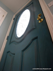
We had purchased a very boring brown door from Home Depot to replace the original one on the house (as seen from the first few pics in the post).  I posted here how I transformed the door with some chalk paint.  As you can see from these new photos, I have changed the color again to match our more brighter decor.  


The mirror was painted the rust orange for another pop of color.  And I used left over painter's drop cloth (left over from the curtains made for the kitchen)  to make the wreath.  You can find the tutorial here


Although I may have started from scratch, I reused where I could.  So I took these perfectly fine side tables we already had and painted.  Here's the post for that one too.  


I love our photo gallery.  It always gets comments from new visitors and the kids get a thrill out of seeing themselves on the wall.  Writing a post about creating the wall is in the works, so keep an eye out for it.


Before anyone else asks, the curtains are from Target.  They are a super popular design and they still carry this style.

So, that's our living room, where the heart of the family beats.  Where you can find Calliou or Wiggles blaring on the TV.  Where we have impromptu picnics by laying a random blanket on the floor.  Where we settle in with our kids and enjoy.  :)

Thanks for reading!


Debbie

Sharing with: